Pull Requests
Works with:
GitHubThis dashboard provides insights into Pull Request (PR) activity within a software repository. It includes charts and tables designed to highlight review speed, comment patterns, throughput, themes, and team dynamics.
Each chart in the dashboard is interactive and supports filtering by author, labels, and date range, allowing you to drill down into the data that matters most for your team. This enables you to monitor team flow and identify bottlenecks.
Dashboard filters
Use these filters in the Pull Requests dashboard tab.
Date range filters
| Dashboard filter | Backend query parameter |
|---|---|
startDate | start_date |
endDate | end_date |
timezone | timezone |
Pull Requests-specific filters
| Dashboard filter | Backend query parameter |
|---|---|
authorSelect[] | authors |
excludeAuthorSelect[] | exclude_authors |
excludeCommenterSelect[] | exclude_commenters |
labelSelector[] | labels |
pullRequestStatus | status |
aggregateBy | aggregate_by |
For list filters ([]), the dashboard sends comma-separated values.
The status filter supports open, closed, merged, and draft. The aggregation filter supports day, week, and month.
The shared date picker, timezone behavior, saved views, and tab navigation are documented in Dashboard.
Outliers and weekend filtering
Average-based PR metrics can include unusually large or small samples, such as a PR left open during a holiday or a burst of automated comments. CLI commands that compute averages expose two cleaning options:
--weekends include|exclude|weekends_only
--outlier-mode include|flag|exclude
--weekends controls the sample set before averages are calculated. Use include to keep all samples, exclude to use weekday samples only, or weekends_only to inspect weekend activity separately.
--outlier-mode controls detected outliers. Use include to keep all samples without reporting outliers, flag to keep all samples and print outliers, or exclude to remove outliers before computing the average. Outliers are detected with the interquartile range rule: values outside Q1 - 1.5 * IQR and Q3 + 1.5 * IQR are flagged. Weekend filtering runs before outlier detection.
These options are available on smm prs average-review-time, smm prs average-open, and smm prs average-comments.
Dashboard cards
The Pull Requests tab includes:
- Average Review Time: review time grouped by author.
- Who Comments The Most: comment volume by commenter.
- Time To First Comment: elapsed time until the first PR comment.
- PRs by Author: number of PRs opened by author.
- Most Commented Pull Requests: PRs with the most discussion, with direct PR links.
- Top Themes in Comments: common terms in PR comments, with links to search for each theme.
- Open PRs Through Time: opened and closed PR volume over time.
- Average Days PRs Remain Open: trend of how long PRs stay open.
- PR Statistics: totals, status counts, label distribution, and summary details.
Statistics and label values link to provider PR pages when the configured provider supports those URLs.
Summary PRs data
Show a summary of the PRs fetched from the repository, including total PRs, average open time, and other key metrics.
Available as the PR Statistics card in the Pull Requests tab and as the Pull Requests summary card in the Insights tab.
Open PRs Through Time
Shows the volume of PRs opened and closed each day. This helps you spot bottlenecks, busy periods, or trends in your team's workflow.
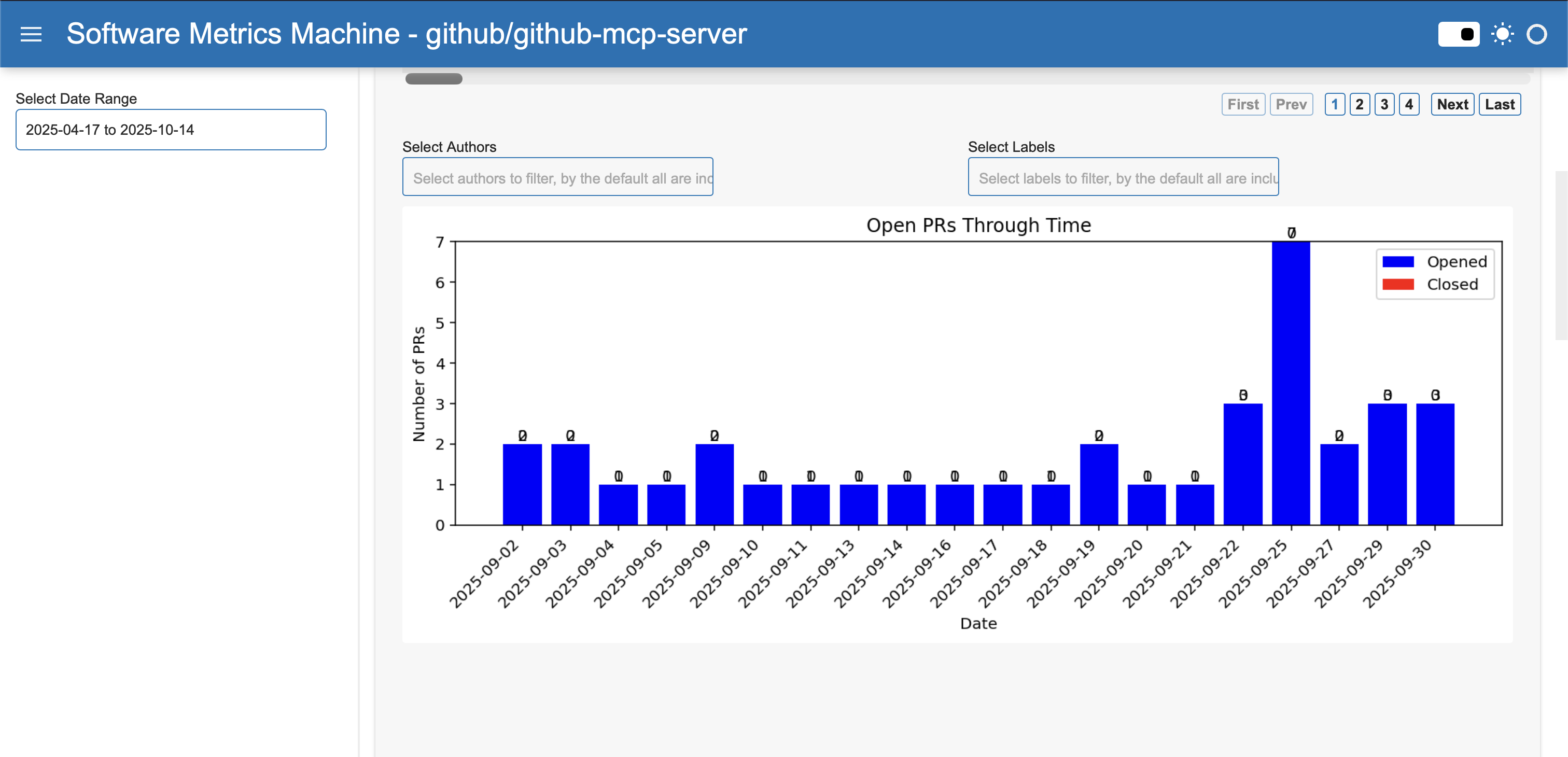
If you notice a spike in opened PRs but few closed ones, it may indicate the start of a new sprint or a backlog forming. For example, if September 25th shows many opened PRs but none closed, it could signal a need to focus on reviews.
How It Computes and Filters
- Aggregates PR events by day.
- Filters by date range (start/end date) - the date used in the prs are the created_at.
- Data is processed to count opened and closed PRs per day.
- You can filter the chart to focus on specific periods, such as a sprint or release window.
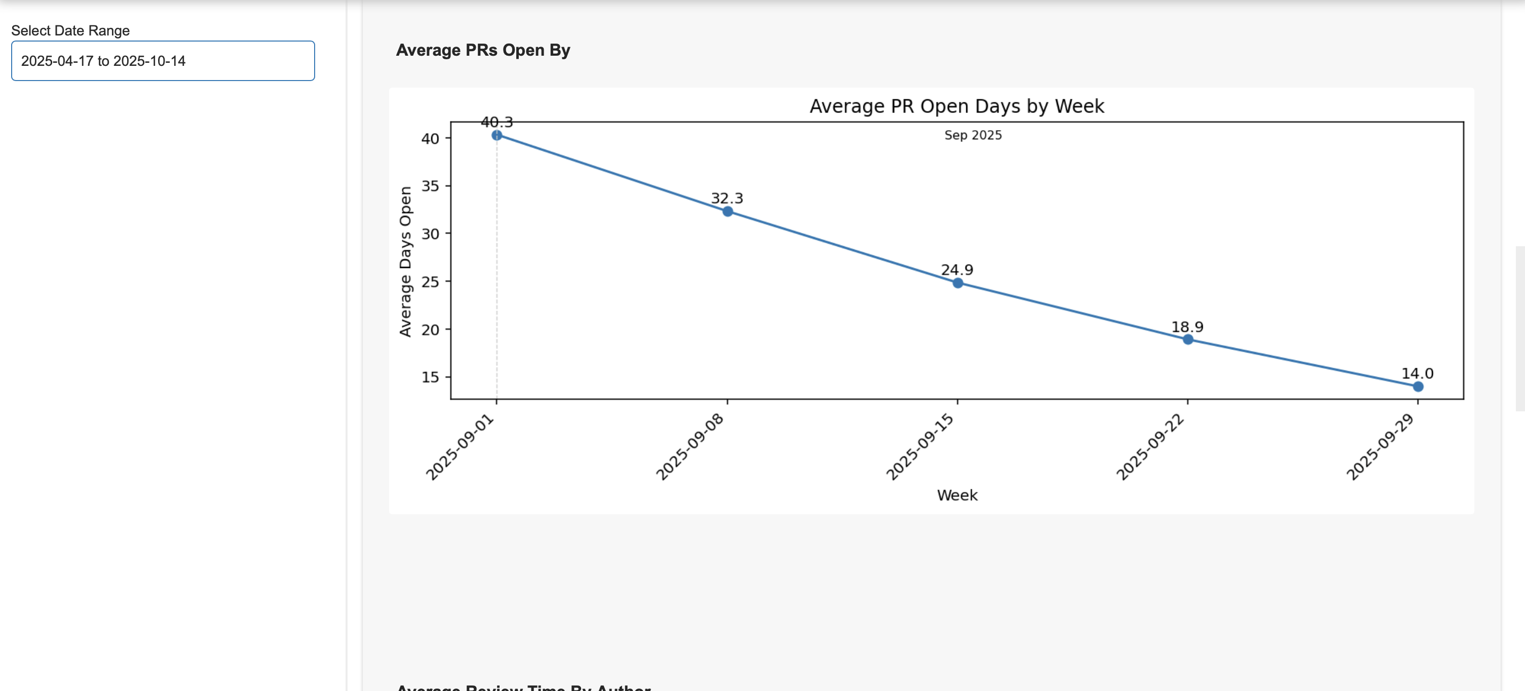
Average PR Open
Tracks how long PRs stay open before merging. It uses weekly or monthly aggregation to show trends in review speed.
How It Computes and Filters
- Calculates the average number of days PRs are open, grouped by week or month.
- Supports filters for author, labels (e.g., bug, enhancement), and date range.
- Aggregation smooths out daily fluctuations, showing long-term trends.
Average Review Time By Author
Plot the average time taken from the team to review a PR open by an author and merge it. The result is shown in average by days.
Example Usage
If one author consistently has longer open times, it may indicate complex PRs or a need for more review support. For example, if Alice's PRs average 7 days open while others average 2, you can investigate further.
How It Computes and Filters
- Computes average open time for each author.
- Filters by top N authors, labels, and date range.
- Data is processed to exclude bots or focus on specific contributors.
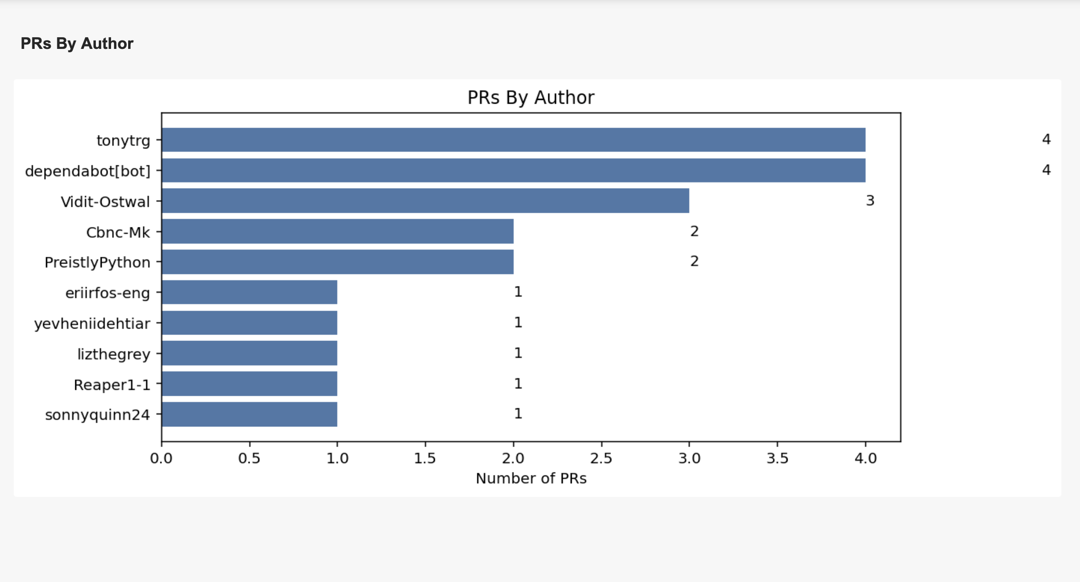
PRs By Author
Example Usage
If one developer is opening most PRs, you may want to redistribute tasks or recognize their effort. For example, if Bob opened 30 PRs in a month, he's a key contributor.
How It Computes and Filters
- Counts PRs opened by each author.
- Filters by top N authors, labels, and date range.
- Includes bots (e.g., dependabot) to show the impact of automation.
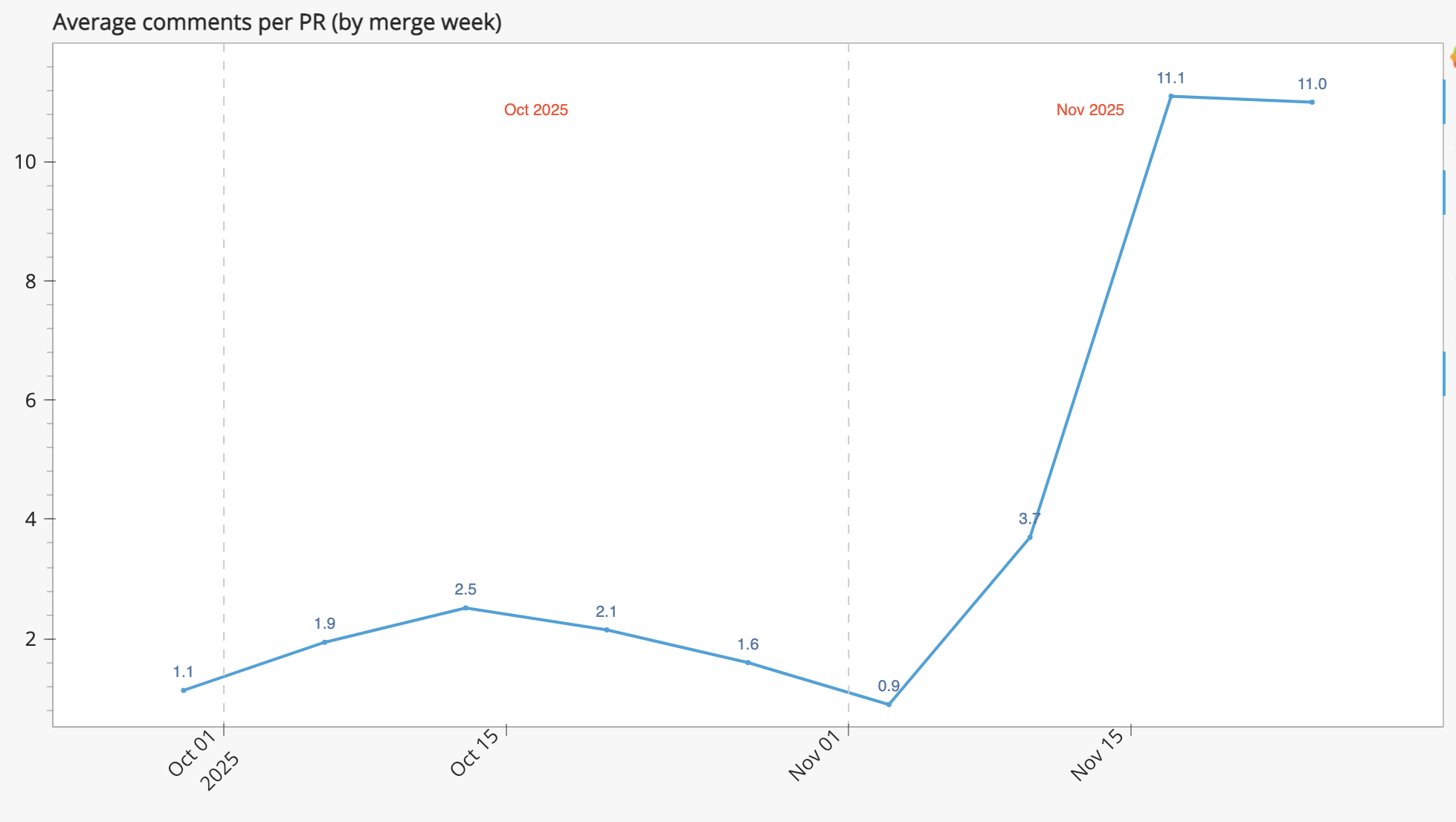
Average Comments per PR
Plot the average number of comments a PR receives before it is merged, aggregated by week or month.